Nostalgia and rebirth
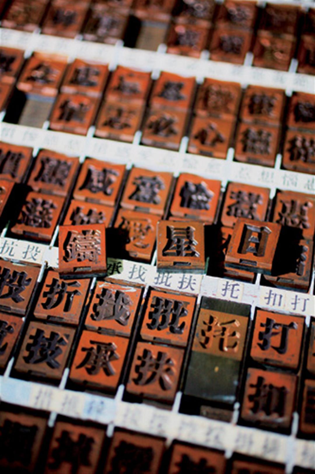
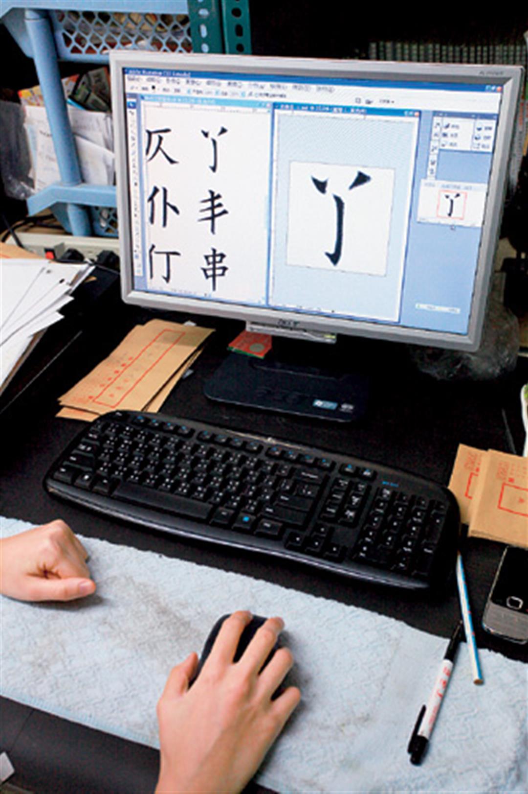
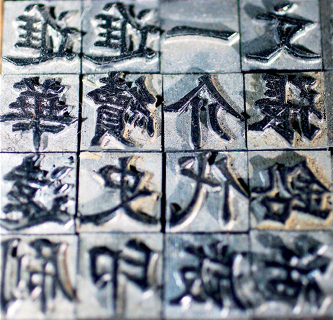
Ri-xing presently has three basic kinds of Chinese fonts--kaiti, -songti ("Song style," based on the movable wood typefaces developed in the Song and Ming Dynasties), and -heiti ("black" or "sans-serif" style, with strokes of uniform thickness)-each in sizes ranging from one through six. There are over 10,000 characters in each size, adding up to a total of more than 300,000 individual types for these three fonts. All told, he estimates that his store holds at least 20 million lead types-too many for him to keep an accurate count, at any rate!
Thanks to the encouragement and word-of-mouth campaign of the arts community, Ri-xing is experiencing a rebirth in the nostalgia market. Even youngsters who couldn't possibly have had much contact with moveable type come to explore the collection in search of classy and culturally potent gifts for friends or loved ones.
Chang Chieh-kuan explains that in Taiwanese, the words for "lead" and "destiny" are homonyms. As a result, giving lead type to someone has the symbolic subtext of wishing for a deep level of involvement. Besides their own name or that of the intended recipient, the most popular type is "love."
"I always say that what Ri-xing lacks most is 'love.' We're always having to cast batch after batch of them. And everyone seems to want them in the -songti font style, which is relatively rare," he smiles.
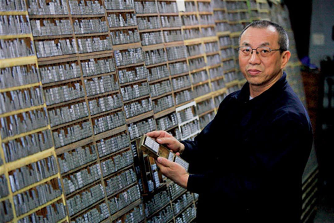
Besides selling lead type, he also hosts the occasional tour of the shop, in which he recounts the vicissitudes of this traditional craft.
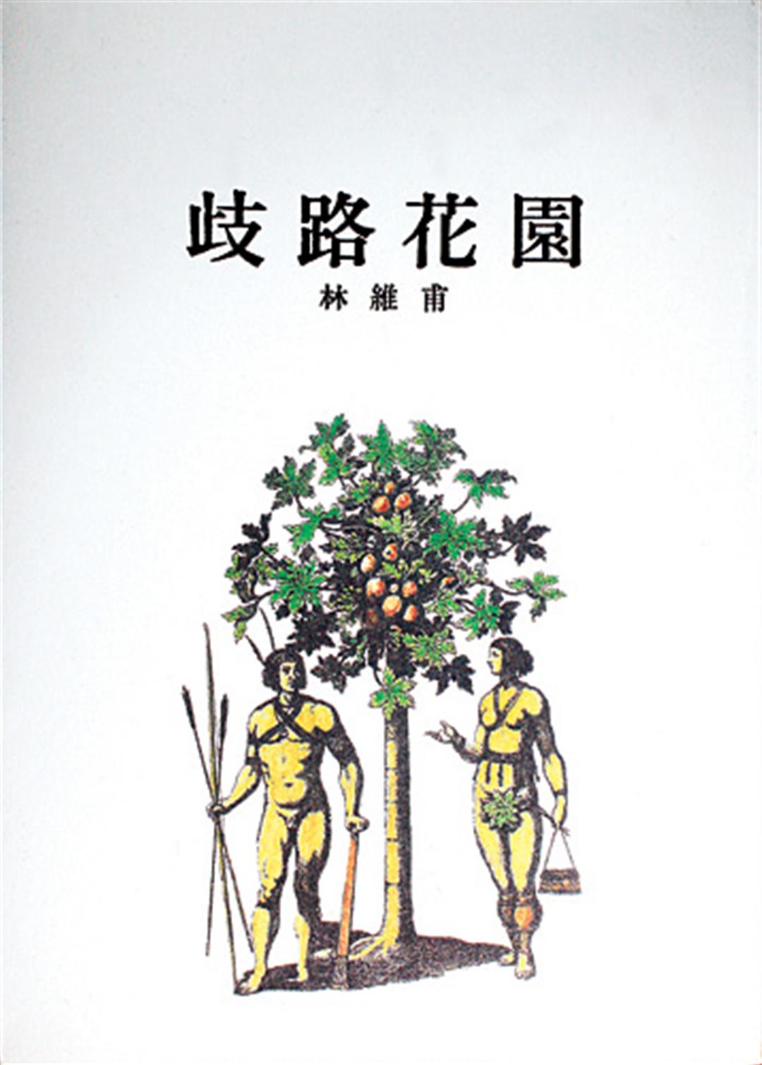
His dedication to traditional printing has earned him respect amongst those in publishing. Recently two acclaimed collections of poetry, Moonlight, by Yan Yun (published by Editions du Fla-neur), and Gardens of the Divergent Path, by Lin -Weifu (published by commaBOOKs), have especially sought out Ri-xing to do the typesetting the traditional way.
Why would any author prefer lead type printing when it costs three times more than using a computer? "Computer characters are hideous!" responds poet Lin -Weifu, not mincing his words. In publishing, the quality and composition of the typography are an essential part of the presentation. Lin's choice of songti, with its aura of classical refinement, is the perfect foil to his burnished contemporary verse.
Others in arts and letters, including poet Xia Yu, have expressed an interest in traditional typesetting. "Perhaps there will be a retro movement," muses Xia.
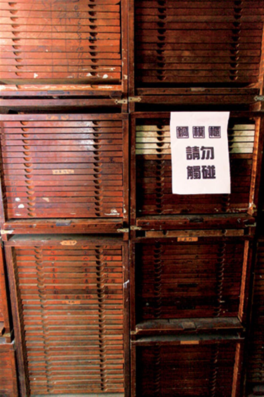
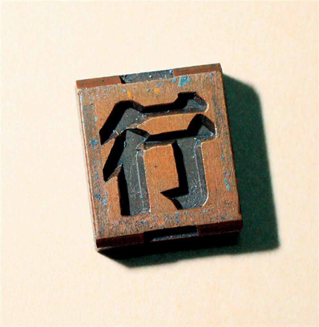
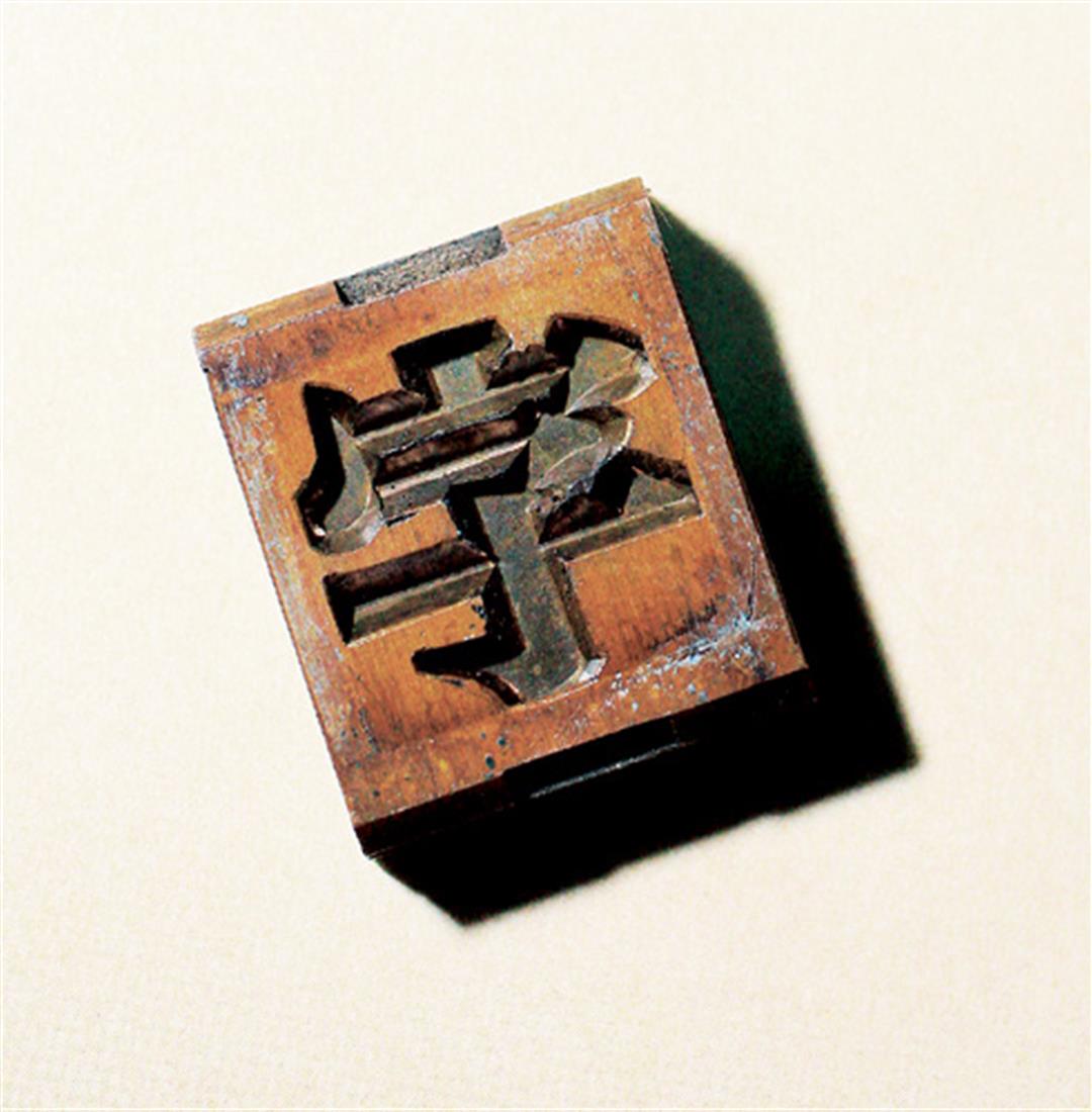
The copper molds that Ri-xing uses to make the type exude old-word refinement.But after yaers of usage, the edges have become distorted and inky, which af-fects the quality of the type.
@List.jpg?w=522&h=410&mode=crop&format=webp&quality=80)


@List.jpg?w=522&h=410&mode=crop&format=webp&quality=80)